Simplifying legal, tax, and compliance workflows through one connected digital experience.
Daga & Co
OVERVIEW
S. Daga & Company is a Chartered Accountancy and professional advisory firm with more than five decades of experience across audit, taxation, advisory, and corporate law. The firm works with businesses across different industries and provides specialized financial and regulatory services.


CHALLENGE
With a long history and multiple practice areas, the firm had a large amount of information to communicate. Services, leadership profiles, company history, industry expertise, insights, and contact information all needed to be accessible without making the website feel overwhelming.
The challenge was to organise this information into a clear experience that communicates trust and expertise from the first interaction. The website also needed to appeal to modern businesses while respecting the firm's long-standing professional identity.
APPROACH
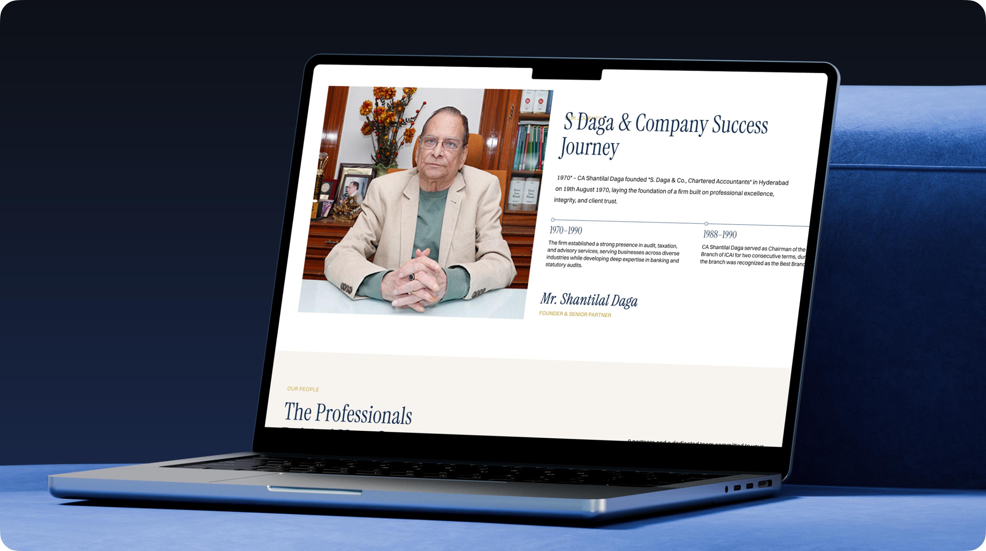
The approach involved rethinking how multiple practice areas are presented to diverse client types. Instead of dense legal terminology upfront, we structured the information architecture to allow easy scanning and progressive disclosure of details.
This design helps quickly establish trust while making their vast expertise easy to navigate.

The visual hierarchy gives important messages enough space while keeping the primary actions visible.
This helps visitors quickly understand the firm's value and continue exploring the services most relevant to them.
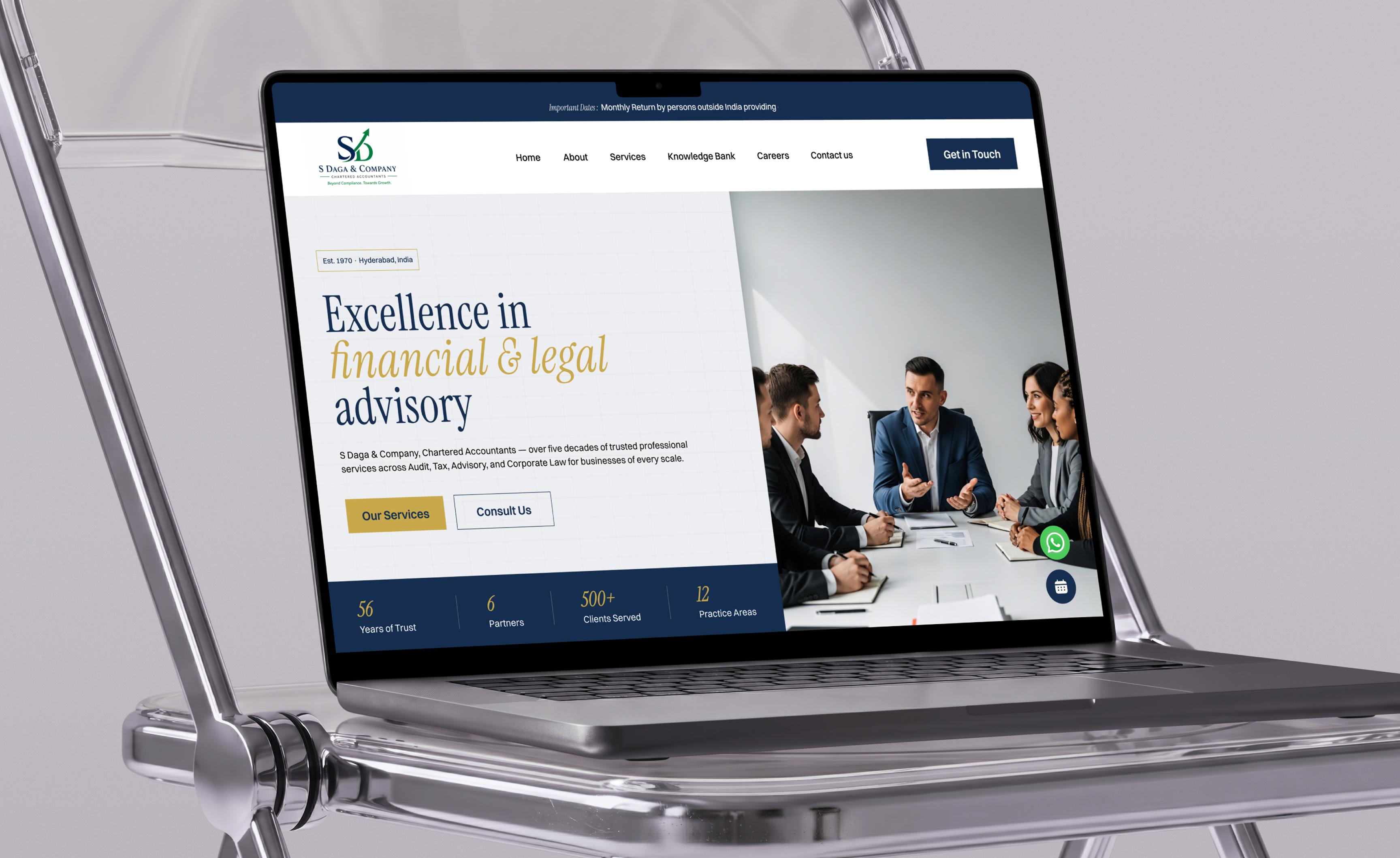
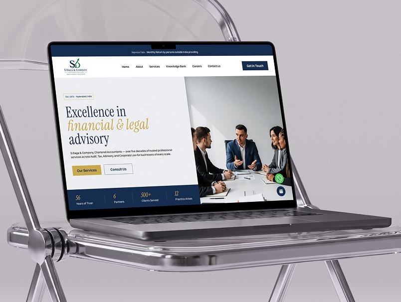
The homepage immediately establishes the firm's positioning through a confident hero section focused on financial and legal advisory.
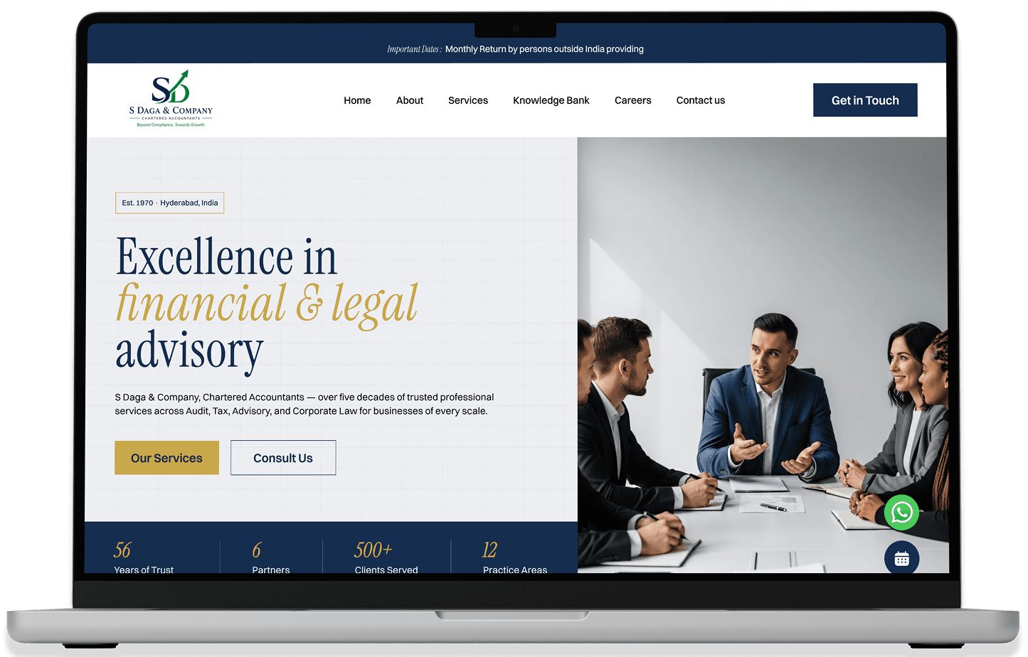
Key statistics and a clear introduction help communicate the firm's experience and scale without requiring users to explore multiple pages.

The visual hierarchy gives important messages enough space while keeping the primary actions visible.
This helps visitors quickly understand the firm's value and continue exploring the services most relevant to them.
The homepage immediately establishes the firm's positioning through a confident hero section focused on financial and legal advisory.
Key statistics and a clear introduction help communicate the firm's experience and scale without requiring users to explore multiple pages.
VISUAL DESIGN
The visual system was designed to communicate professionalism, trust, and modernity. Strong typography, structured grids, refined spacing, and carefully selected imagery create a premium corporate experience.
The interface avoids unnecessary visual complexity and gives priority to content hierarchy. This allows important information such as services, expertise, statistics, and enquiry actions to remain easy to scan.
COLORS
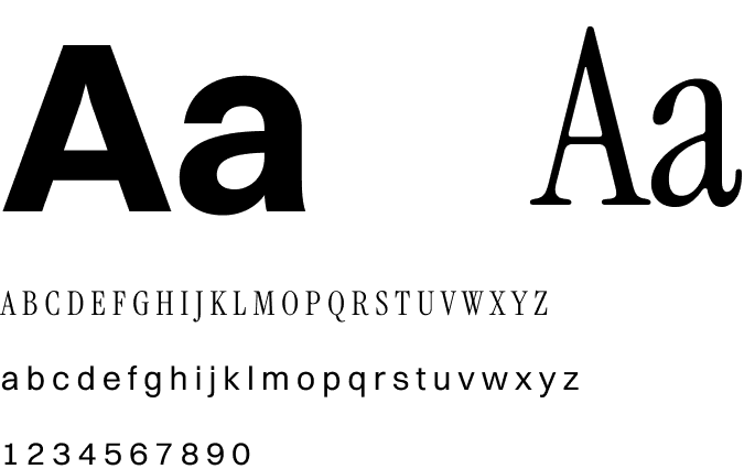
TYPOGRAPHY
FINAL EXPERIENCE
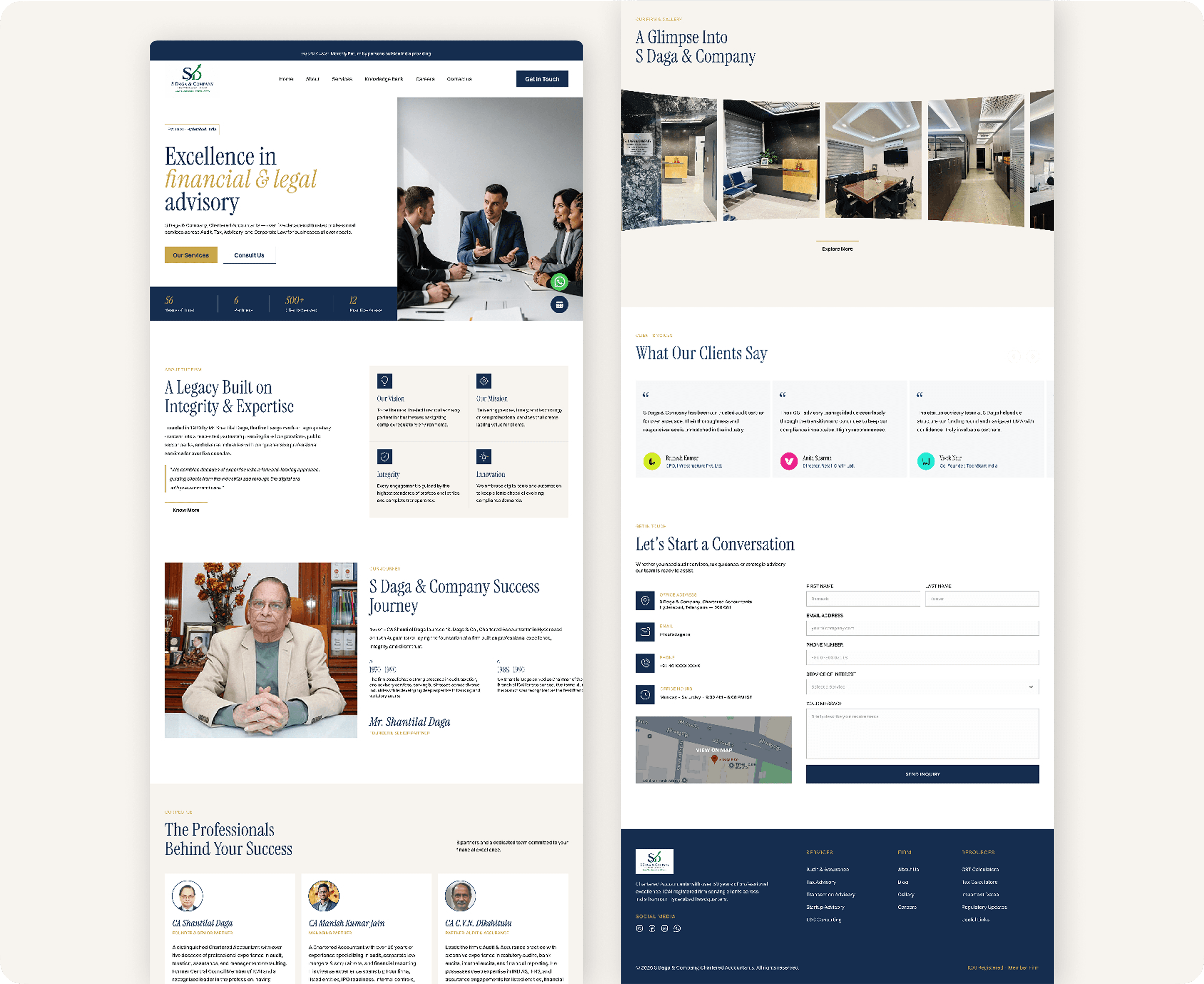
The final website brings together the firm's legacy, services, people, expertise, insights, and contact journey into one cohesive digital experience. Visitors can understand the organization, explore relevant services, learn about the team, and move naturally toward an enquiry.
The result is a modern corporate website that respects the firm's established identity while presenting it in a more contemporary and accessible way.
NEXT PROJECT
Imlli Adrakee
Bringing creative ideas to life through advertising, media, and production.